Good. I hate the double swipe down to adjust brightness.
god android was so much better before like… 2016. never forget what’s been taken from you
So they put the WiFi and mobile data toggles back? And made the rest a sensible size again? No? Bugger.
You can resize all the toggles now
Oh cool
Sorry, is this in current android or the beta? I’d love to know how
Beta. It’ll be available in Android 16
Rip good buddy:

Don’t forget the collapsed view, where you could fit twice as many toggles as the bullshit we have now.
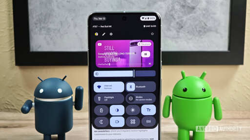
Google is continuing its work to split up Android’s notifications and Quick Settings panels.
Holy shit, can we stop copying this stupid feature from the iPhone???
Sure hope there’s a setting to keep both together (OneUI does this), I find the split panels so annoyingUS companies think the world is the same as America, so if Apple does something, everyone scrambles to copy for the sake of picking up their dregs. Samsung have already implemented this UX, so Google are now outliers, they’ve kinda got no choice.
I like the differences from swiping on the right or left though I hope you can customize the size of those areas like LineageOS for easier one handed use, that’s how I had my previous phone setup essentially. Not a fan of getting rid of pages personally but like they’re bringing the full customizability to the toggles like NothingOS15 has currently.

This looks absolutely horrible for one handed users.
The two hardest regions to reach on the phone.
I hope they maintain the “double swipe down” gesture as well.
You can pull down on the left or right of your home screen
Gross, it looks way too much like iOS for my taste. Glad I’m switching away from Google controlled android anyway, I’ll be customized back to the old stuff if I have to.
This is great - I really dislike the current horizontal scroll when there’s still so much unused screen space.