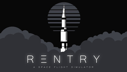
Do you have what it takes to be an astronaut? Reentry is a realistic space flight simulator based on NASAs space programs; from the first American human spaceflight in Project Mercury, the rendezvous and EVAs of Project Gemini to the Moon landing in Project Apollo.
given the “E” is stylized it’s not really that much of a stretch to interpret it as two Es mashed together; it seems clear to me and the “typo” criticism comes off as unnecessarily pedantic
(e: I didn’t downvote the comment, but it did leave a bad taste in my mouth)


Not sure why anyone would downvote you for that; it’s true!
given the “E” is stylized it’s not really that much of a stretch to interpret it as two Es mashed together; it seems clear to me and the “typo” criticism comes off as unnecessarily pedantic
(e: I didn’t downvote the comment, but it did leave a bad taste in my mouth)
That’s a pretty big stretch if you ask me. It’s barely one “E” let alone two (and perhaps a hyphen)
I’m interpreting it as two Es blurred together (like horizontal motion blur), if that makes sense? idk it makes sense to my brain
Hey if it works for you… but to me it just looks like three horizontal lines. An E without the vertical bar.