I thought this was going to be a video essay on Star Trek Phase II but I was pleasantly surprised

To be fair, the design of Discovery is very close to the Phase 2 concept art

Wow. You’re not joking even a little bit. I hated Discovery’s design when the first teaser came out, but she’s my favorite right after the Intrepid class now.
I’m still in the hate camp. To me, it looks like a Star Trek ship design made by a primary school student on a cafeteria napkin.
That’s what’s good about it, the beauty of the OG Enterprise was that any kid could draw it. It’s just three cylinders and saucer.
Big fan of that design but even more of Disco (Season 1 that is)
Very snazzy. I should rewatch House.
I always felt the negative version of these titles looked so much better.
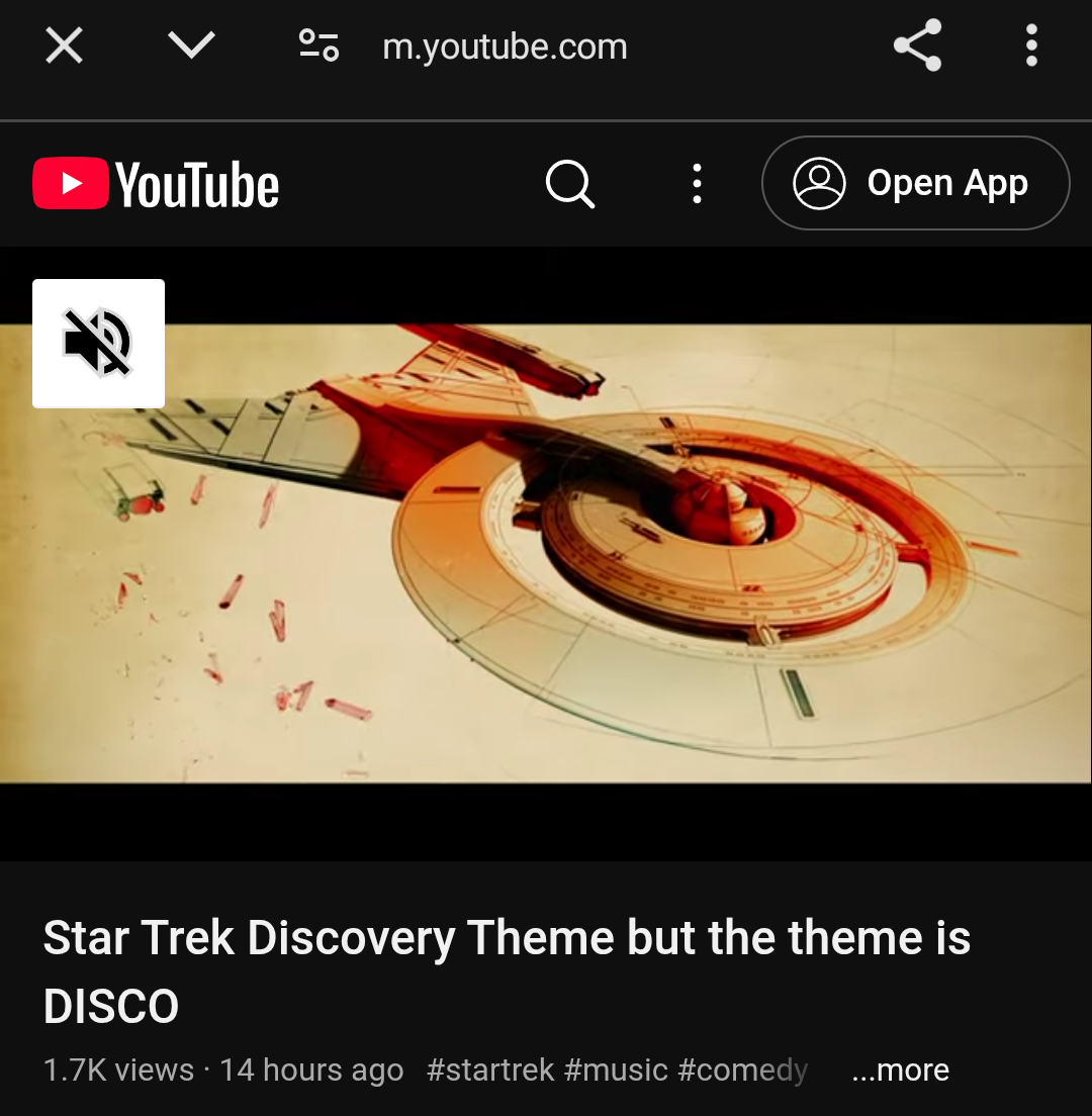
I’d never seen it before so I had to have a Google
That looks pretty cool too
Omfg that was so good. Makes sense too.
Following the link I get a disco version of the STD theme.
Yes.