- cross-posted to:
- science@lemmy.world
- cross-posted to:
- science@lemmy.world
You must log in or # to comment.
“at ages 9, 32, 66 and 83”
That seems incredibly specific and absolutely arbitrary considering the massive difference from individual to individual
Yeah, agreed. It reads as if a bunch of computer scientists did some data analysis without statisticians or biologists.
Here’s the original paper:
https://www.nature.com/articles/s41467-025-65974-8
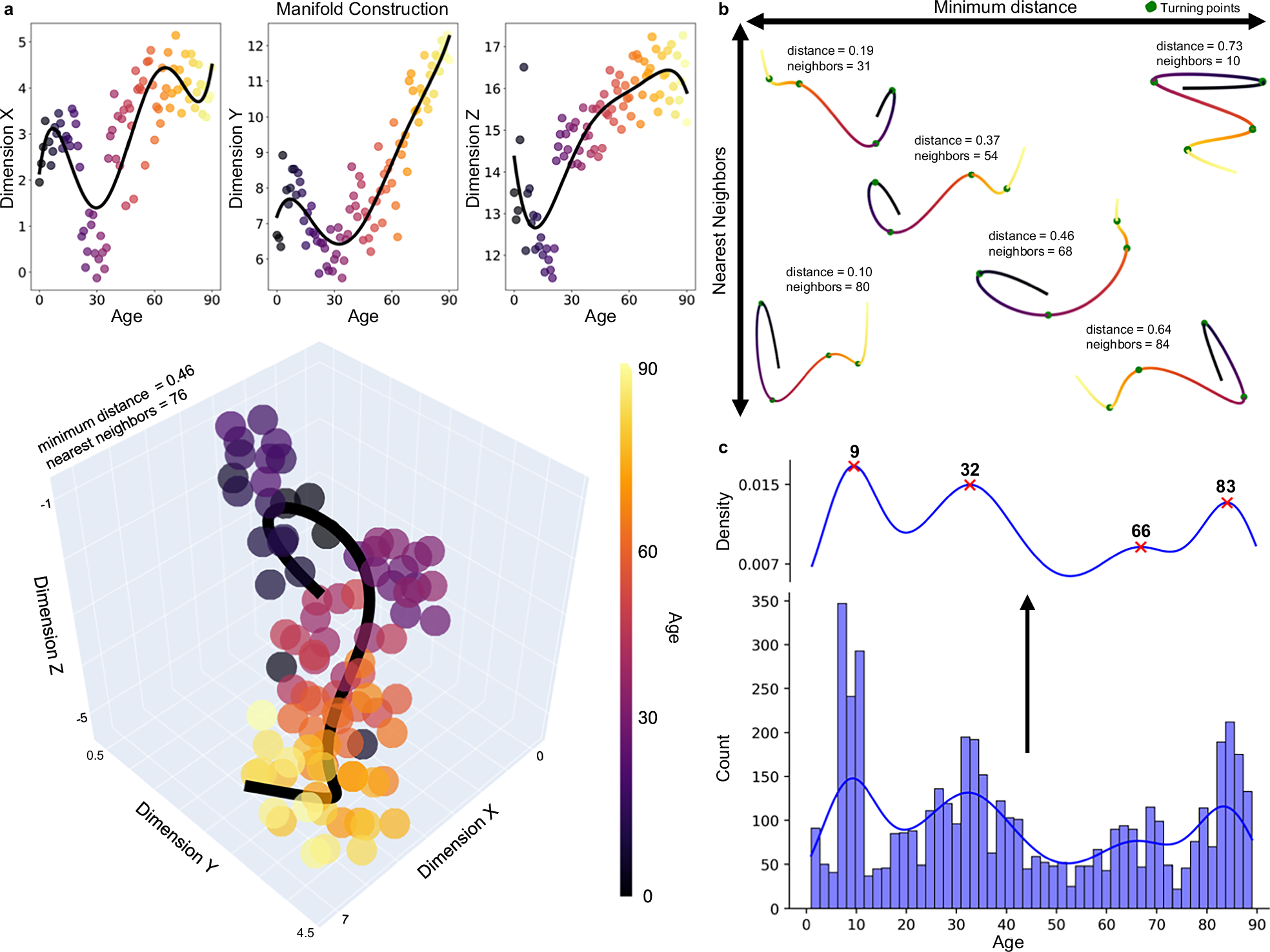
They’ve taken a number of measured attributes:
All graph theory metrics were calculated using the Brain Connectivity Toolbox (BCT) in MATLAB 2020b38. Global measures included network density, modularity, global efficiency, characteristic path length, core/periphery structure, small-worldness, k-core, and s-core, while local measures utilized were degree, strength, local efficiency, clustering coefficient, betweenness centrality, and subgraph centrality.
Smoothed to fit a curve to the data:
In these models, cubic regression splines were used to smooth across age, and sex, atlas, and dataset were controlled for.
Reduced the dimensions using Uniform Manifold Approximation and Projection. Basically, if you have this data “height in inches”, “height in cm”, “weight in kg” it would ideally keep “weight” roughly the same but have a single “height” but you couldn’t rely on the units. They condense the input data down to four dimensions keeping age as the independent variable.
To project topological data into a manifold space, we used the UMAP package in Python version 3.7.335. Before data was put into the UMAP, it was first standardized using Sklearn’s StandardScalar
Then they created a polynomial fit for each dimension:
Polynomials were fit using the polyfit() function from the numpy package, which uses least squares error95. Together, these polynomials create the 3D line of best fit through the manifold space. For our main analysis, we fit 5-degree polynomials
Then they found the turning points and where they were are the ages. Here’s a plot and you can see even after all this cleanup the ages are noisy and it’s really surprising they’ve chosen ages as specific as they have:
I have no idea how they went back through to make up the summary for each “epoch” they identified. There’s obviously a lot of information for them to use here but it also seems like there could have been more creative license than ideal.
It really reads as an early idea that I don’t think should be pushed to the general public until other scientists have scrutinised it more (otherwise you end up with a whole lot of coffee is dangerous, coffee is healthy leading to people not trusting science)
They say that fitting different degree Polynomials robustly identifies inflexion points seeing 10, 30 and 80. I think they only went for a higher degree because it was “visually underfit” at lower degrees, ie no scientific basis.
This is already after the dimensionality reduction which has its own arbitrary choice that affects what inflexion points you can identify.
This definitely smells like “we threw some data into a bunch of statistical analysis without thinking about it and wrote down anything that looked publishable”
The key word is average
Is it?
I think this is more confounded than “average” and I think that even in their turning point analysis they’re being excessively specific:
Surely does not come close to what I would personally consider from experience…
I’d say pre-16, 16-24, 24-37/40, and I’ll discover the rest for myself as I go
But that’s only four
Before 9, 9-32, 32-66, 66-83, after 83
-
Ignorant stupid.
-
Insufferably stupid.
-
Bigotedly Stupid.
-
Nostalgia Stupid.
-
Obliviously Stupid.
Where are you on that scale these days?
Off the scale stupid, baby!
-
If they said it then I missed it, but I wonder how much variation there is between individuals and how much that follows genetics and external factors like (un)healthy habits, environment, experiences, etc.